Enhancing UX for Qosina and Qosmedix Websites
Introduction
In this case study, I will outline my role and contributions in redesigning the user experience (UX) for three new websites for Qosina and Qosmedix. This project aimed to improve the overall user journey, ensuring it was intuitive, engaging, and aligned with business objectives.
Background
Qosina and Qosmedix, leading suppliers of medical and cosmetic components, recognized the need to revamp their digital presence to better serve their diverse customer base. The goal was to create a seamless and engaging user experience that would cater to both new and existing customers, driving higher engagement and satisfaction.
Objectives
Redesign the UX for three new websites.
Conduct user research to understand customer needs.
Perform competitor analyses to benchmark against industry standards.
Collaborate with marketing and front-end development teams.
Ensure the new designs are tested and validated before launch.
“I'd prefer not having to wait to add an item to my cart and then go to my cart to see that the item is not currently in stock. I'd rather this information is shown in the product page.”
Research and Analysis
To begin the project, I conducted comprehensive user research and competitor analyses. This involved:
User Research:
Interviews: Conducted in-depth interviews with key user segments to gather insights into their needs, preferences, and pain points.
Surveys: Distributed online surveys to collect quantitative data on user behavior and expectations.
Usability Testing: Observed users interacting with the existing websites to identify usability issues and areas for improvement.
Competitor Analysis:
Analyzed competitor websites to understand industry best practices and identify opportunities for differentiation.
Assessed competitors' UX strategies, features, and content to benchmark against our own designs.
What is your preferred method of browsing products?
Responses:156
The data shows that 69% of Qosina employees preferred browsing through the search bar. This can be due to employees searching for SKU's because they are familiar with our website.
When looking for a specific product, do you have trouble finding the product you are looking for?
Responses:156
Overall Qosina customers revealed that the main problem when browsing products are there are too many inconsistencies. For example, users will find it difficult to sort similar products that are too close in size and look.
Design and Collaboration
With the research insights in hand, I collaborated closely with the marketing and front-end development teams to design the new websites. This process included:
Wireframing and Prototyping:
Created wireframes and high-fidelity prototypes using tools such as Figma and Sketch.
Iteratively refined the designs based on feedback from stakeholders and users.
Documentation:
Developed detailed design documentation to ensure clear communication of design intent to developers.
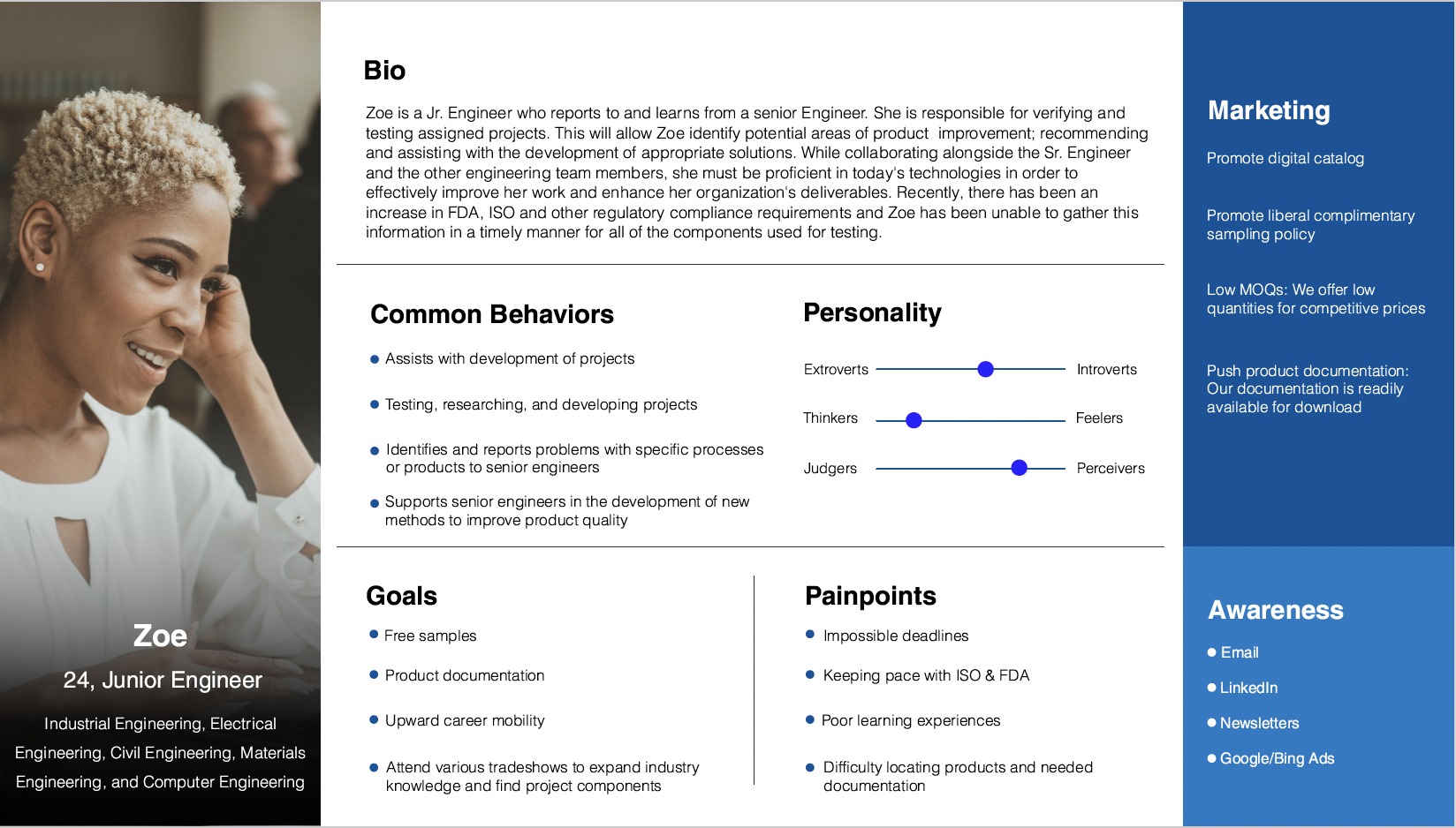
Included user journey maps and personas to highlight customer needs and pain points.
Testing and Validation:
Conducted usability testing on prototypes to gather feedback and make necessary adjustments.
Worked closely with front-end developers during implementation to ensure designs were accurately realized.
Service Blueprinting
Implementation and Results
The redesigned websites were launched successfully, leading to several key improvements:
Enhanced User Journey:
Streamlined navigation and improved user flows made it easier for customers to find information and complete tasks.
Visually appealing and well-organized content increased user engagement.
Increased User Engagement:
Significant improvements in user engagement metrics, such as longer session durations and reduced bounce rates.
Positive feedback from users highlighting the enhanced usability and aesthetic appeal of the websites.
Business Impact:
The new websites contributed to increased customer satisfaction and supported the company's business objectives effectively.
Website Mockups
View my sample of work
Conclusion
This project demonstrated the value of a user-centered design approach, leveraging thorough research and close collaboration to deliver websites that met user needs and business goals. By focusing on user experience, we successfully enhanced the digital presence of Qosina and Qosmedix, driving higher engagement and satisfaction.


